
 English
 русский
 Français
 Español
 Português
 Deutsch
 عربى
عربى
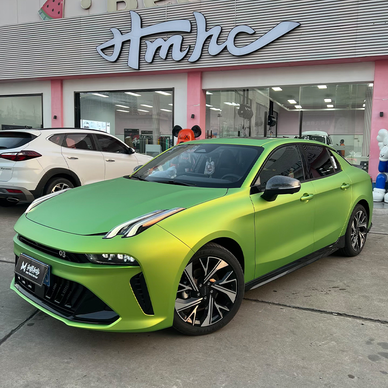
Discover an irresistible fusion of nature and sophistication with the Matte Grape Green TPU Color PPF — an ultra-matte film that captures the lush, ve...
See Details
Home / News / Industry News / Color Match Explained: Tolerances, Light Sources, and Film-to-Paint Accuracy
Color Match Explained: Tolerances, Light Sources, and Film-to-Paint Accuracy
Content
- 1 What Color Match Actually Means in Film Manufacturing
- 2 How Color Accuracy Is Measured and Specified
- 3 Surface Finish Changes the Color You See
- 4 Metallic, Pearl, and Angle-Dependent Finishes
- 5 Light Sources, Substrates, and Aging
- 6 Three Scenarios Where Color Match Gets Decided
- 7 A Procurement Checklist for Holding a Color Match
A quarter panel comes off the lift with a deep scrape, and the owner wants paint protection film in the same grey as the rest of the car — not approximately, exactly. Whether that request can be met has little to do with luck. A workable color match is a formulation and measurement exercise: selecting pigments, dispersing them into the right polymer, and signing off a numeric tolerance that a spectrophotometer verifies rather than the naked eye. It also comes with an honest limit. When the comparison crosses material systems — liquid paint on one side, TPU film on the other — the realistic target is a controlled approximation, because different resin systems carry identical pigments differently. This article explains where that limit sits, how film manufacturers measure it, and what buyers should demand before committing to a color.
What Color Match Actually Means in Film Manufacturing
In film production, color matching means combining pigments, dyes, and special-effect colorants to reach a specified color inside a specific polymer. The polymer matters as much as the pigment: the same red chemistry dispersed into a thermoplastic polyurethane carrier will read differently from the same chemistry in a paint binder, because particle size, resin refractive index, and layer thickness all change how light is absorbed and scattered. That is why a chemically identical match across film brands — or between film and paint — is not realistically on offer; what is on offer is a measured, agreed closeness.
On a TPU color PPF line, the colorant sits in a dedicated layer or coating over the TPU base film, with a clear topcoat above it. Three consequences follow for buyers:
- The match is engineered at the formulation stage and reproduced batch after batch, not corrected by eye at the end of the line.
- Every production batch is measured against a retained master panel, never against a phone photo or a customer's memory.
- Finish is part of the color: gloss, matte, and pearl versions of the same hue are separate products with separate readings.
For a concrete example of how one finish family is defined and documented, our overview of crystal color PPF technology and performance data shows what sits behind a stated color standard.
How Color Accuracy Is Measured and Specified
Color difference is quantified with a spectrophotometer that reads a sample in CIELAB coordinates: L* for lightness, a* for the red-green axis, b* for the yellow-blue axis. The distance between a sample and its master standard is expressed as Delta E (ΔE), a single number both parties can write into a purchase agreement. Numbers replace arguments — a batch measuring 0.8 against the master is objectively closer than one at 2.4, no matter who is judging by eye. The ranges below reflect common practice in film and coating production.
| Delta E Value | What the Eye Typically Reports | Typical Commercial Use |
|---|---|---|
| 0.0 – 0.5 | Difference virtually impossible to see, even side by side | Master standard approval, laboratory verification |
| 0.5 – 1.0 | Faint difference only under direct side-by-side comparison | Common production tolerance for solid colors |
| 1.0 – 2.0 | Noticeable when panels sit next to each other | Acceptable only with panel breaks or blending |
| Above 2.0 | Clearly visible mismatch at a glance | Normally rejected and reformulated |
Two notes sit behind those figures. Solid colors are normally held to tighter tolerances than metallic or pearl finishes, because flake orientation adds a variable a single measurement angle cannot capture. Measurement conditions are part of the specification too: instrument geometry, the backing behind the sample, and whether the film is read free-standing or laminated over a standard grey card all shift the result. A tolerance is only meaningful when both sides measure the same way.
Surface Finish Changes the Color You See
A matte or satin surface scatters reflected light in many directions instead of one, so the same pigment formula reads lighter and less saturated than it does in a gloss finish. Place a satin grey film next to a gloss grey painted panel and the eye reports a mismatch even when the underlying color readings are close. The practical rule is to match finish level first and hue second, comparing samples at the same gloss level you intend to install.
This is also why film makers treat finish as part of the formula itself: a satin grey is developed and approved as a satin grey, with its own master panel and tolerance, not converted from a gloss recipe with a different topcoat. Buyers comparing matte and satin options should expect the swatch book to show wider visual variation between finishes of the same hue than between batches of one finish.
Satin AMG Gray TPU Color Paint Protection Film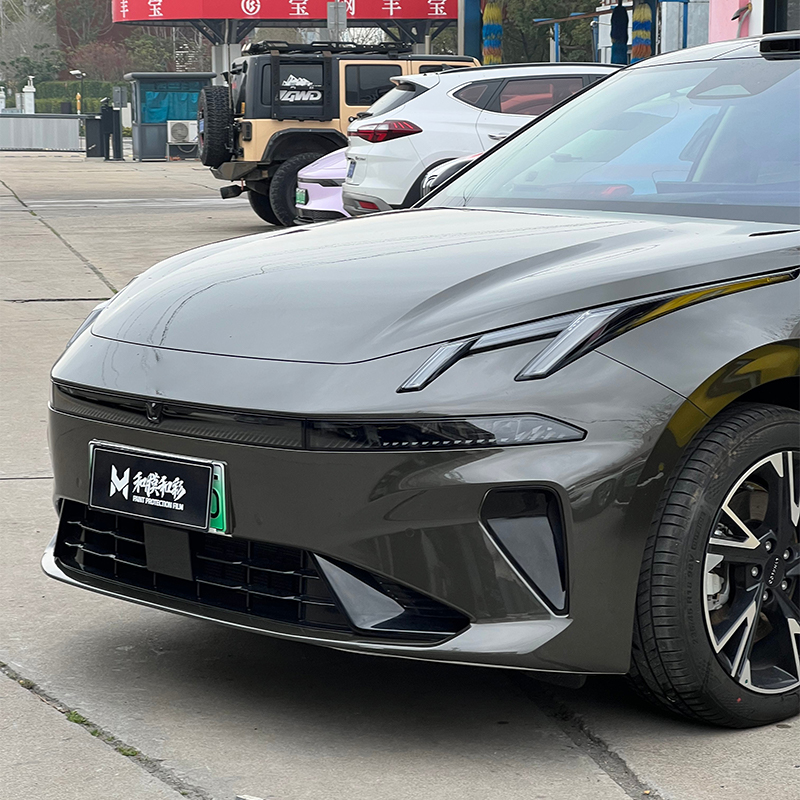 Satin AMG Gray Premium Matte TPU Color PPFThis film pairs an AMG-matched grey pigment system with a satin-matte topcoat on 8 mil self-healing TPU. It fits here as an example of a finish developed and approved with its own master panel rather than converted from a gloss recipe.View Product →
Metallic, Pearl, and Angle-Dependent Finishes
Metallic and pearl films carry aluminum or mica-based effect pigments whose appearance depends on flake orientation beneath the topcoat. Two panels cut from the same roll can look different if one was stretched more during installation, because stretching re-tilts the flakes. Specifying these finishes therefore takes multi-angle readings and side-by-side comparison against physical master panels; a single standard measurement angle will hide the very property the buyer is paying for.
Chameleon and other multi-tone films push this further, shifting hue across the viewing angle by design. They cannot be pinned to one CIELAB point, so the working standard is a master panel plus defined viewing geometry — for example, color stated near-perpendicular and again at 45 degrees.
Metallic Pearl Color PPF Series Metallic Pearl Color PPFPearlescent particles embedded in the TPU base create a multi-dimensional shimmer whose appearance shifts with viewing angle. Multi-tone films like this are judged against a master panel at defined viewing angles, not a single color measurement.View Product →
Light Sources, Substrates, and Aging
Two colors that look identical under daylight can split apart under warm showroom lighting. This is metamerism, and film matched to paint is a prime candidate: the two systems are built from different pigment sets that can agree at the measured wavelengths but not across the whole visible spectrum. Judge any candidate match under at least two light sources — standard daylight and the warm white typical of showrooms — and confirm it outdoors in direct sun before approval.
The substrate matters as well. A color layer that hides completely over a grey test card may telegraph a dark factory panel underneath, so opacity and the adhesive's own tint belong in the specification, and samples should be viewed over the actual vehicle color where possible. Age complicates things further: paint shifts under years of UV exposure, so the honest procedure is to measure an older panel as it stands today rather than assume the original factory shade.
Three Scenarios Where Color Match Gets Decided
Wrapping to a factory paint reference
Many buyers arrive with a factory color in mind rather than a swatch. Manufacturers respond by developing shades that sit close to popular factory greys, whites, and reds — one grey in the crystal color line, for instance, was built around a well-known sports-car factory shade. Even so, the correct procedure is to lay a physical sample on the actual car and view adjacent panels in daylight. A match that passes on a swatch card can fail on the vehicle, where hood and door curves send light in different directions.
Porsche Grey Crystal TPU Paint Protection Film Porsche Grey Crystal TPU Paint FilmA cool, medium-toned grey built around a well-known sports-car factory shade, with self-healing TPU protection. It suits this spot on matching factory colors, where physical samples must still be checked on the actual car in daylight.View Product →
Panel repair on a wrapped vehicle
When a wrapped panel is damaged, film offers a structural advantage over paint: replace the entire panel from the same roll and there is no panel-to-panel delta to argue about. Blending only becomes relevant where film meets remaining paint, and the safest break is at a body line or panel edge rather than mid-surface.
Reordering a color months later
Repeat orders are where weak quality systems get exposed. Record the batch number of the original delivery, keep a retained sample, and require the new batch to be measured against the same master standard. A manufacturer that runs its own quality control system can quote a reorder tolerance; an operation that only repacks finished film usually cannot.
A Procurement Checklist for Holding a Color Match
The following sequence keeps a color match verifiable from first inquiry through installation:
- Define the reference under controlled daylight: clean panel, standard light source, finish level noted.
- Request physical swatches or draw-downs from the production line, and treat renders and photos as marketing rather than evidence.
- Agree a numeric tolerance in writing — Delta E of 1.0 or lower is a reasonable target for solid colors — together with the measurement geometry both sides will use.
- View samples under at least two light sources, at multiple angles for effect finishes, and directly on the target vehicle where possible.
- Check opacity and behavior over the real substrate color, since good hiding on a test card does not guarantee the same over a dark panel.
- Order the full quantity plus installation oversize from a single batch, and record the batch number for any future reorder.
Treat color match as a specification rather than a hope. Define the master standard, agree the tolerance and how it will be measured, verify under real lighting on the real vehicle, and control batches from a single production run. Manufacturers that hold formulation, coating, and inspection under one roof can repeat those numbers order after order, which is what turns "close enough" into a documented result. For shades outside the standard catalog, custom color development follows the same steps, and the fastest start is to send a physical reference panel with the required quantity so the factory can evaluate opacity, tolerance, and sample feasibility in a single pass.
Related products
-
-

Make an absolute statement with the Laser Black TPU Color PPF — a cutting-edge, technologically sophisticated film that elevates black to an entirely ...
See Details -
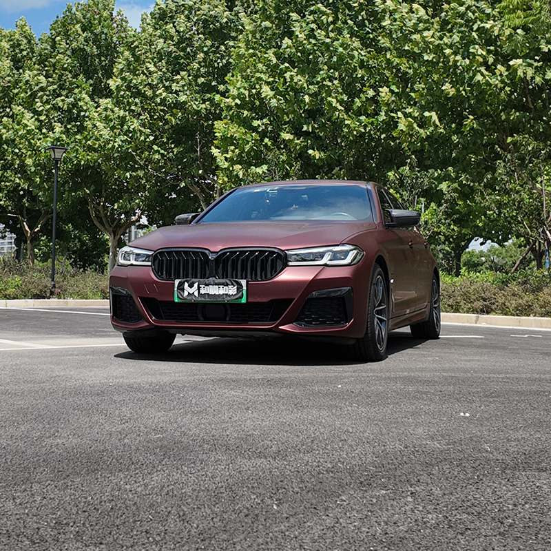
Experience the rare elegance of fine Burgundy wine in automotive form with the Matte Romanée Red TPU Color PPF — an ultra-matte film inspired by the l...
See Details -

Define ultimate sophistication with the Black Matte TPU Color PPF — the purest, most essential expression of automotive minimalism available. This is ...
See Details
GET THE LATEST QUOTATIONS
-
 No. 5, Datang Road, East District, Development Zone, Guangde City, Xuancheng City, Anhui Province,242200, China
-
 [email protected]
-
 +86 18170340295
PRODUCTS
MOBILE WEB
Copyright Anhui He He New Materials Co., Ltd. All Rights Reserved.
 Wholesale TPU PPF Film Automotive TPU PPF Manufacturer